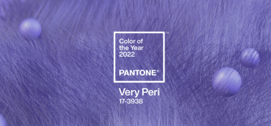
Pantone has introduced the "Color Of The Year 2022: Pantone 17-3938 Very Peri, a dynamic shade of periwinkle blue with an invigorating violet red undertone. Combining the fidelity and consistency of blue with the energy and excitement of red, this is the happiest and warmest blue hue of all, bringing a stimulating mix of newness.
"As we enter a world of changethe choice of Pantone 17-3938 Very Peri offers a new perspective and a new vision of the blue family, well known and widely appreciatedsays Leatrice Eiseman, executive director of the Pantone Color Institute. Encompassing the qualities of blues with a touch of red-purple, Pantone 17-3938 Very Peri expresses a bright, cheerful attitude and dynamic presence that encourages bold creativity and imaginative expression. "
" The Pantone Color of the Year reflects what is happening in our global culture. It expresses what we are all looking for, and tries to answer itadds Laurie Pressman, vice president of the Pantone Color Institute. The creation of a color for the first time in the history of our Pantone Color of the Year educational color program reflects the innovation and transformation underway globally. As society continues to recognize color as an essential form of communication and as a way to express and symbolize ideas and emotions, to engage and connect, the complexity of this new blue hue punctuated by a touch of red-purple highlights the breadth of possibilities before us. "
Pantone 17-3938 Very Peri in clothing and fashion accessories
Pantone 17-3938 Very Peri, a warm, friendly blue hue suggesting carefree confidence and a joyful attitude, encourages uninhibited expression and experimentation. It expresses a dynamic presence, an enthusiastic blue hue whose fantasy lends itself to unpredictable color harmonies and spontaneous color statements. Futuristic in appearance, Pantone 17-3938 Very Peri takes on distinct appearances when applied to a variety of materials, finishes and textures, from shimmering metallics and glossy sheens to high-tech materials, handmade looks and natural fibers.
Pantone 17-3938 Very Peri in cosmetics and hair
Suggesting personal inventiveness and bold imagination, Pantone 17-3938 Very Peri provides an original touch for eyes, nails and especially hair in a variety of finishes and applications from glitter and glam to powder matte.
Pantone 17-3938 Very Peri in decoration and interior design
Evoking the new modernity, Pantone 17-3938 Very Peri injects a sense of playful freshness into interiors, enlivening the space with unusual color combinations. A versatile shade that enlivens our creative spirit, Pantone 17-3938 Very Peri is suitable for a range of different materials, textures and finishes. It provides a splash of color, whether on a wall, accent piece or interior design, or as an intriguing and eye-catching accent in a pattern.
Pantone 17-3938 Very Peri in packaging and multimedia design
By merging the steady, continuous shades of blue with the energy and excitement of red, Pantone 17-3938 Very Peri conveys a message of credibility and creativity. Whether it appears in a digital fantasy world or on physical materials, Pantone 17-3938 Very Peri exudes a good-natured warmth that quickly catches the eye, making it an ideal color for many graphic design, multimedia and packaging applications.


